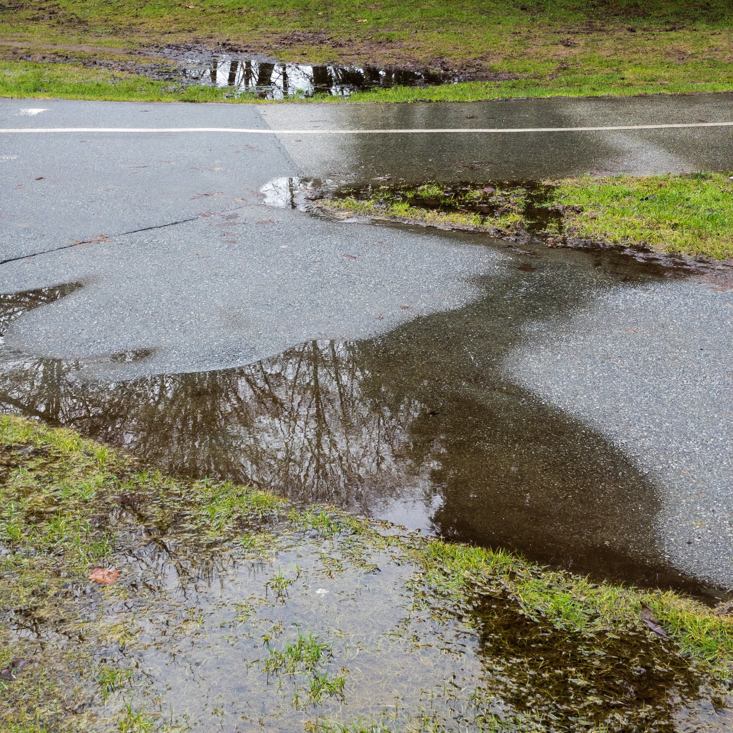
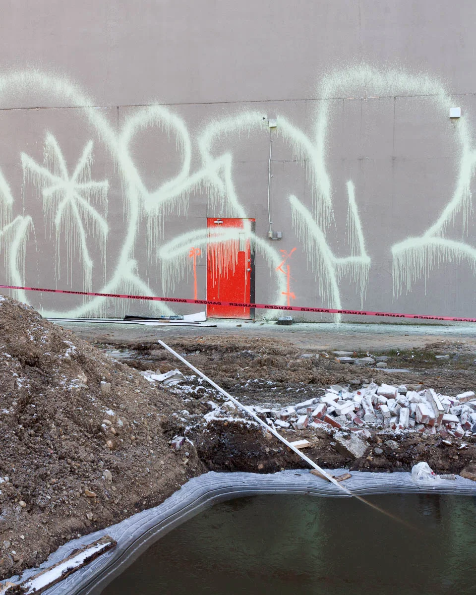
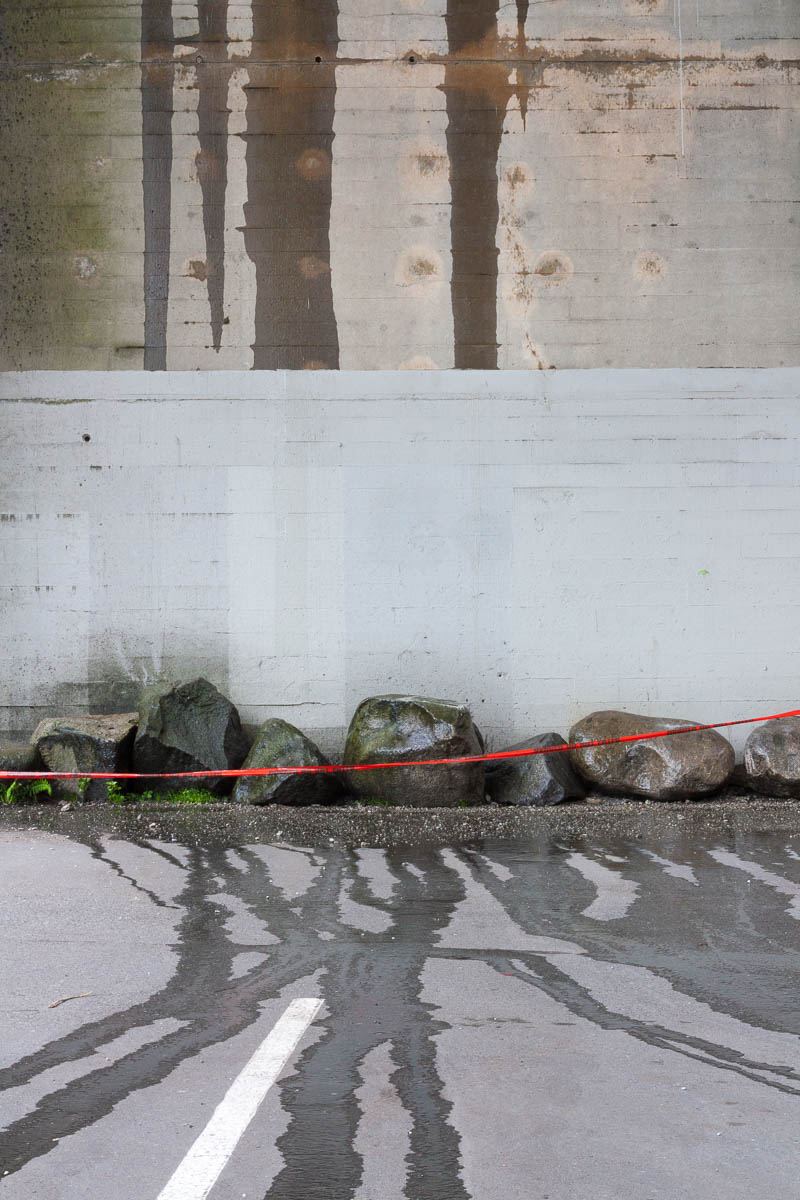
New Camera

I got a new camera. An iPhone 12 Pro. That’s got me out making photographs again.

The three focal lengths suit my photography well. I sometimes wish I had something a little longer, but I don’t suffer too much without it.

It’s interesting to me that I can now edit the photographs on the same device I used to make the photographs. I’ve been using Adobe Lightroom for both. And it auto-magically uploads the photographs to the cloud so I can easily view and edit them on a computer as well.

The entire experience is kind of remarkable.

I miss a traditional view finder, but I’m getting used to using the screen to compose the photographs.

APC_0212.jpeg
IMG_0057.jpeg
APC_0167.jpeg

City Shadows

I think photography might be a seasonal activity for me.  Here's a couple from January and February of 2015.  

Took me a few minutes to remember how to create a blog post.  I see there are a couple of draft ones that I never posted, I'll have to see if they are worth publishing.  

My Unique Take on Yosemite

Recently, I had the opportunity to travel to Yosemite.  It is one of THE iconic photo locations, so I felt it was important for me to add my own interpretation.

Prior to leaving, I spent days researching possible locations on Flickr, Instagram and 500px.  I found some I liked and was able to determine an exact location using GPS.  That allowed me to have a very precise plan before embarking on my trip from Vancouver.  

It was a long trip, but I was delighted when I finally arrived at my target location using the Google Maps application on my iPhone.  I managed to capture this distinctive view, so the planning was definitely worth it.

I thought I was the only person who considered capturing this unique vantage point, but as I left I ran into my friend Floris.  After some brief small talk, I left Floris to take my spot in the photographer lineup (it was standing room only).  He managed to capture his own unique take of this iconic view.  I highly recommend seeing it over on his blog: 

http://www.artinnaturephotography.com/wordpress/2015/fresh-air-and-fresh-views/

Falling Victim to the Whims of Chance

I did an analysis of my Vancouver photographs looking at streaks of outings with no first-rate photographs.  The streaks were longer than I expected, but that can be attributed to the whims of chance.  My analysis of streaks re-enforced for me the importance of continuing to take photographs even if there has been a prolonged period of disappointing results.

For more information on methodology see my post on Photography Analytics.

I analyzed 101 Vancouver outings.  There were 30 outings with one or more first-rate photographs for a probability of 0.3 (30/101).  That's consistent with what I expected.  Before doing the analysis, I estimated 1 in 3 outings resulted in at least one first-rate photograph.  

The number of first rate photographs on any given day depends on chance.  It’s like flipping a coin.  I know I’ll get heads or tails on each flip.  I also know that I might get several heads or several tails in a row.  With the photographs, I know there’s a 1 in 3 chance I’ll get 1 or more first-rate photographs on any outing.  There will be streaks of consecutive outings with first rate photographs.  There will also be streaks where there are no first-rate photographs for several outings in a row.

Our intuition often fails us when it comes to randomness:

People tend to think that streaks in random sequential events are rare and remarkable. When they actually encounter streaks, they tend to consider the underlying process as non-random.

from http://www.ncbi.nlm.nih.gov/pubmed/20728080

This psychological expectation can play havoc with my confidence.  Based on my estimate of 1 in 3, I accept not every outing will be successful and that unsuccessful outings will outnumber the successful ones by 2:1.  It’s natural to expect luck to be evenly distributed.  That is, there will be a successful outing followed by a couple of unsuccessful ones followed by another successful one and so on.

Chance - randomness - doesn’t work that way.  Rather than being the exception, streaks are the norm.  

Even knowing this, I still expect - or at least hope - my luck will be fairly evenly distributed.  I start to feel a little hard done by if there are more than two days in a row without any first-rate photographs.  If the streak extends to three days or more, it begins to feel like a mounting crisis.  On the other hand, sometimes the wins come more frequently.  Rather than attributing this to good luck, I start to believe I have somehow “levelled up” and will now continue to produce at a higher rate.  It’s an emotional see-saw.

Here are my streaks of consecutive outings where I had no first-rate photographs.  A streak-length of zero means I had one or more first-rate photographs in back-to-back outings.

101 outings, length of streaks with no first rate photographs

My streak lengths have a median value of 2 and 75% of the streaks are three or less outings in length.  But 25% of the streaks are 4 or more outings in length and I went on one streak lasting 8 outings in a row!   That can seem like an eternity.  If you're only going out once a week that two month stretch might be enough to convince you to pack it in.  (it feels a little less painful when I'm shooting more frequently than that.)

It's tempting to think I must have been doing "something wrong" during those streaks.  However, this distribution looks similar to randomly generated streaks.

I built a simulation of 101 streaks where the probability of 1 or more first-rate photographs in an outing is 0.3.  Here's the results from three different simulations:

The streaks vary considerably with every simulation.  

It turns out a streak of length 8 or more is quite likely.  I ran the simulation 10,000 time recording the longest streak of each simulation.  Using these simulation results, I calculated the probability of a simulation having at least one streak greater than a given length.   

10,000 simulations of 101 outings with probability of one or more first-rate photographs in an outing = 0.3

100% of the simulations had a streak at least 4 outings long and 69% of the simulations had a streak of 8 outings or longer.  Rather than being an exception, a streak of 8 is to be expected. 

The expected length of streaks is dependent on the percentage of outings with one or more first-rate photographs.  For example, here's what the simulation looks like if the probability increases to 0.5.

10,000 simulations of 101 outings with probability of one or more first-rate photographs in an outing = 0.5

Even if the odds are 50/50 of getting a first-rate photograph on an outing, there is a greater than 50% chance of having at least 5 outings in a row with no first-rate photographs.  Ouch.

I conclude that despite my best efforts, streaks will happen.  Rather than getting discourage I just need to accept it and carry on.  

The photograph that preceded the streak of 8 consecutive outings without any first-rate photographs.

The Infatuation Half-life

Based on my selection process over the past month, my infatuation half-life for new photographs seems to be about two weeks.

Infatuation is the state of being carried away by an unreasoned passion or love.
— http://en.wikipedia.org/wiki/Infatuation
Half-life (t1⁄2) is the amount of time required for a quantity to fall to half its value as measured at the beginning of the time period.
— http://en.wikipedia.org/wiki/Half-life

I haven't been sharing those photographs because I decided to slow the sharing pace.  But, I'm photographing regularly and making selections as I go along.

I use Lightroom to manage photographs.  After an outing, I do a first pass and mark the ones I like with a five-star rating.  I'm generous at this stage, giving photographs the benefit of the doubt.  After a day or two, I revisit the outing and revise my ratings.  I may add a five-starting rating to some and decrease the rating of others.  I'll add the ones with a five-star rating to a project-specific collection.

Within a collection, the first-rate photographs have a five-star rating.  The newly added photographs join that esteemed collection.  Some may be down-graded right away when I see them in the context of other first-rate photographs.  

Often, there are new ones I'm sure will make it as first-rate photographs.  I mean, positively certain.  There may even be several like that - which is very exciting.

I review the collection from time to time, as a minimum whenever I add new photographs to it.  As I do this, the ratings of recently added photographs begin to fall.  The ones I thought were definitely most excellent, fade to a more provisional status.  On the next viewing, it becomes clear most of the provisional ones definitely don't warrant a five-star rating.  Those infatuations are over, replaced by new ones.  That process of going from "almost certainly a first-rate photograph" to "definitely not a first-rate photograph" takes about two weeks.  The ratings seem to stabilize after that.    

Recently, I've discovered a mental test that may be shortening the infatuation half-life.  I ask myself: "When I decide to share these new photographs, would I select this as the first one to share?"  If the answer is no, I downgrade it.  

I think there will be a longer term "competition" to keep those five-star ratings, driven by factors other than infatuation.

Iona Beach, 2013

Photography Analytics

As a product manager I make extensive use of analytics to gain insight and make decisions.  I'm working on some posts discussing photography analytics.  In this post, I want to discuss my motivation and methodology.  

I photograph with the hope of creating "first-rate photographs".  They are first-rate for me and may not be for other people.  They are the ones I'd include a portfolio.  They are rare and my choices are somewhat fluid with photographs falling in and out of favour.

I believe luck plays a role.  Therefore, persistence is required for success.  

The need for persistence is not a profound insight.  I hope analytics will provide further motivation for persistence, by quantitatively re-enforcing it's value!  

For example, I'm currently looking at streaks.  My hypothesis is that dry spells happen and that chance alone can explain a lot of it.  The best strategy is to just keep photographing.

I work in "outings".  That is, I pick up my camera and go out with the intention of making photographs for inclusion in a portfolio.  During an outing I'll make some number of "exposures".  If I'm lucky, one of those exposures will be a first-rate photograph.  If I'm really lucky, more than one exposure will be a first-rate photograph.  But (in my case) there are no first-rate photographs from the majority of outings.

Most of my work is digital and I store work by date so keeping track of outings is straight-forward.  Some while after an outing, I can record the number of first-rate photographs.  The Prairie Modern photographs were made with a 4X5 film camera, so I won't do analytics for them.   

People using analytics are fond of using acronyms such as FRP for first-rate photograph.  I'll try to avoid them, but may resort to using a few if I find it getting repetitive.

An example of a statistic is the average number of first-rate photographs per outing (0.4 for my Vancouver photographs).  

Another is the percentage of outings that have one or more first-rate photographs (0.3 for the Vancouver photographs).  That's also the probability of one or more first-rate photographs from an outing.

(The probability of having one or more photographs in an outing is lower than the average number of photographs per outing because some outings have more than one first-rate photograph.)

Hopefully that wasn't too bruising.  I should publish the first photography analytics post next week.

One of the earliest first-rate photographs:  

Sunlit Trees, Medicine Lake, Jasper National Park, 2002

Questioning the Ideal

When I looked back at my photographs from 2014 the urban ones didn't seem as cynical as I thought they might be.  On reflection, I think it's just less overt.    

My Vancouver photographs seem motivated by the contradiction between an idealized version of Vancouver and the reality on the ground (which is perhaps a clever turn of phrase given how that idealized vision incorporates towering condos). 

Looking at the photographs (yet) again, I concluded that even the ones appearing to be a straight-up representations of an idealized Vancouver are still questioning that ideal in some way.  Consider this photograph:

Dwelling, Vancouver, 2014

It’s a view of an attractive townhouse entrance.  But my interest lies in the contrast with the tower sitting above it.  The towers are striking, but their scale is alienating when experienced from the ground.  The homes in the sky are financially out of reach for most people.

The questioning appears in other ways.  Vancouver, like most Canadian cities, is very young.  Yet, there are signs of decay and neglect.  Rather than acquiring character buildings simply wear out.  They are disposable.   

Shrouded, Vancouver, 2013

Claymore Parking, Vancouver, 2013

Steps, Vancouver, 2014

There’s more to be written about the Vancouver photographs in future posts.  But I want to touch on how the Prairie Waters and Prairie Modern photographs also question ideals.  

The prairies are often imagined as a pastoral ideal.  In practice, the it's criss-crossed by a grid of roads.  I can just as easily see it as a vast food manufacturing operation.  I think of the Prairie Modern photographs as both representing and questioning the ideal.

Power Pole, Alberta, 2005

The Prairie Waters photographs question an ideal in a different way.  People might not consider the shallow lakes in central Alberta beautiful.  Certainly they don't attract visitors the way the Rocky Mountain parks do!  But mud can be beautiful if you look at it in the right way.  So, they question the ideal of conventional beauty.

While I may be questioning an ideal, ambiguity arises because there is also genuine affection.  I unabashedly love the open spaces of the prairies.  Vancouver may be flawed, but it’s an easy city to love. Green stains on concrete can be seen as verdant or decrepit.  I'll write more on this ambiguity in a future post.

Constructive Discussion

I appreciate discussions about photography that give me something to build on.  

I’ve never been drawn to still life.  But the exhibition Marvelous Things: The Art of Still Life curated by Aline Smithson (author/publisher of LensScratch) expanded my concept of still life.  I realized still life encompassed a broad range of objects and could be a found scene.  Thanks to Mark Hobson for bringing it to my attention.  Mark has a piece in that exhibition and is an accomplished practitioner of the art of still life. 

I mostly photograph scenes that are bigger than me.  If I walked into the scene my entire body could be included in the frame.  I think of these as landscapes.  Sometimes I photograph scenes that are smaller than me.  I’ve never been sure what to make of these photographs.  I’ve started to think of them as found still lifes.  I’m not sure why it makes a difference to think of them that way, but it does.  It’s provided a context for me to explore more of them.

Having another path to explore, helps get me out the door to make photographs.  Once I’m out the door, I’ll photograph not only still lifes but other things that present themselves to me.      

Consistent with my recent resolution to slow the sharing pace, I’m not going to share any new work to illustrate the point.  We’ll revisit in the future to so if the inspiration yielded fruit.  But here’s an older example of the sort of thing I have in mind. 

(The new ones have a slightly different feel because I've been composing them for the square.)

Urban Still Life, Vancouver, 2014

Concept and Intuition, Part 3: Urban Photographs

In Part 2, I discussed the role of concept when photographing the prairies.  In this post I’ll continue by discussing it in the context of my urban photographs.

I started photographing the city with the loose idea of producing a prairie trilogy: natural, rural and urban.  At the time I was obsessed with creating photographs that were abstract and minimal without resorting to extreme cropping.  There were some successes:  

Backside, Edmonton, 2006

Alley Shadow, Edmonton, 2006

There were also lots of photographs of walls with various things on them.  I found these less satisfying.  It seemed to me I was trying to impose a minimalist ideal on an environment that was frequently chaotic.    

With the Prairie Waters and Prairie Modern photographs I drew inspiration from abstract painting.  I likened the natural photographs to abstract expressionism and the rural ones to color field painting.  I began to think cubism might be an appropriate reference for urban environments.  I made a few tentative efforts to produce cubist photographs, but the results were disappointing.    

Eventually, I gave up my preconceptions and just started photographing what appealed to me.  I photographed sporadically.  Looking at photographs from that period, there are many inspired by a minimalist aesthetic.  But there were others embracing more complexity.  I seemed to be developing a new grammar for photographing the city.

Mall Entrance, Edmonton, 2007

Eventually, I gained confidence in this new grammar and began photographing more frequently.  There was only concept in a broad sense.  I was trying to make honest photographs of Edmonton while staying true to the way I see.   

When I moved to Vancouver, I carried on in much the same way.  I was invigorated by having a new city to explore.  From the beginning the Vancouver photographs seem more complex and sophisticated.  

Convention Centre, Vancouver, 2012

Growth, Vancouver, 2013

Without doing so consciously, I was now making photographs that realized the cubist ideal I imagined many years before!

My approach to the urban photographs has been pretty consistent.  I pick a direction (if I’m walking out the door) or a neighbourhood (if I’m driving) and see what I find.  I try to vary the locations.  Sometimes I re-visit and other times I seek out something new.  I avoid back-to-back visits to the same place.

I have no specific agenda, but themes emerge.

For example, in Edmonton there are what I think of the ‘blank spaces’.  These are certainly informed by the minimalist aesthetic, but they are also seem true to the character of the city.   

Industrial Facade, Edmonton, 2012

There are also photographs of things protruding from the landscape. 

Protruding, Edmonton, 2008

There are photographs of malls.

Southgate Mall, Edmonton, 2007

None of these themes make an appearance in the Vancouver photographs.  Surfaces in Vancouver are covered in growth.  There are malls in Vancouver, but they are not as integral to the character of the city.  In downtown Vancouver, nothing breaks the horizon because you rarely see the horizon - it’s obscured by towers or mountains.  

The Vancouver photographs have their own themes emerging.  The city is trying to transform itself into an idealized and often exclusionary version of itself.  There is a strong demarcation between the west side and east side of Vancouver.  There are contrasts and contradictions to explore.

Chaotic, Vancouver, 2013

Behind, Vancouver, 2014

Between 4852 and 4864, Vancouver, 2013

I’m trying to nurture these themes while leaving room for others to emerge.  I’ve become more attentive to the politics of development.  I’ve read a little history on different neighbourhoods.  I’m doing research and formulating concepts to feed back into intuition.      

This series of posts on concept and intuition was motivated by the Vancouver photographs.  I'm looking back to learn from those experiences.  I hope to better understand what’s emerging and explore how I can re-enforce it conceptually without clobbering the flow.  

Other posts in this series:
Part 1: Prairie Waters
Part 2: Prairie Modern

Slowing the Pace

I’m slowing my image sharing pace to favour quality over quantity.  

In a good year, I might produce 26 first rate photographs, an average of one every 2 weeks.  If I post several images a week that’s 150, so 85% of those will be second rate. 

I can’t think of a good reason to share that 85%.  If I let the photographs sit for a while I can sift the best from the merely good.  I’m not sure how long the minimum evaluation period needs to be.  Longer is better, but that’s balanced by my ego’s desire for a few accolades.  We’re talking months anyway.

I’ve been actively photographing but won’t post any new ones for a while.  The internet will survive.  In the mean time, I’ll keep posting contemplations and continue considering various sequences and combinations.  

After two years, I still like this one, so I think it's in.

Mural, Vancouver, 2013

Concept and Intuition, Part 2: Prairie Modern

In Part 1, I proposed a model for the roles of concept and intuition and discussed how it played out in the Prairie Waters project.  In Part 2, I’m going to examine the Prairie Modern project.

It could, and perhaps should, be called Roads and Horizons.  It’s two projects that I banged together after the fact when I put this site together.  I felt neither project was strong enough to stand on its own and they are closely related.  

The roads came first.  I was driving along the highway connecting Edmonton and Calgary taking pictures in my head.  It occurred to me I should make an effort to take some of those photographs with a camera.

I went on excursions to photograph around roads.  I started by focusing on overpasses, but the results weren’t satisfying.  One winter morning I was wandering along a ditch overlooking the highway.  Rather than looking out into the surrounding fields away from the road - a more conventional point of view - I was looking back onto the road.  

Pair, Alberta, 2005

Pair, Alberta, 2005

Roads are often framed as a visual pathway leading into a scene.  The view from side appealed to me because it shows the road slicing through the landscape.

I included objects in and around the roads as integral parts of the composition.  I was interested in drawing attention to mundane details often excluded from the frame.

Farmhouse, Alberta, 2005

Later I began simplifying the scenes into horizontal lines.  This was in part a response to observing how completely these landscapes have been transformed and groomed by people.  It's like the landscape has been machined into this simpler form.  

After Gursky, Alberta, 2005

I also stumbled upon the idea of framing scenes to include the top of the road as the foreground. 

Cracked, Alberta, 2005

Pond, Alberta, 2005

Such variations seem informed by both concept and intuition.  

Driving through the prairie provided ample time to consider concepts, perhaps to the point where I was getting in the way of myself.  

I was seeking more abstract images.  I imagined photographs with a few, simple bands of colour like a Rothko painting.  That contrasted elegantly with the Prairie Waters photographs which I likened to abstract expressionist paintings.  But that search became frustrating because roads are usually a messier affair.  My pursuit of an idealized landscape could blind me to the one in front of me.  Or perhaps I just needed to be more committed to finding those simplified landscapes.  At the time, I felt I was driving into a cul-de-sac.     

One evening, I was driving to an area where I planned to spend a few days photographing roads.  I had gotten a late start, so as twilight arrived I was mostly focused on reaching my destination.  I came upon a pile of grain.  It seemed like a pyramid.  Even though it wasn’t a road I felt compelled to stop and photograph it.

Prairie Pyramid, Alberta, 2005

I liked the idea of that photograph so much I abandoned the roads and spent the next several days making photographs of smallish things on the horizon.  This was one of them.

Tractor, Alberta, 2005

I sought more like this and found a few adhering to the strict format:

Canola Power, Alberta, 2005

Herd of Deer, Alberta, 2006

But again, they were difficult to find and I became frustrated.  It’s an interesting concept, but one that requires more patience.  I was very pleased with the deer.  I wanted some cattle and horses.  Rather than hoping to come upon such a scene by chance (as I did with the deer) I could have improved my chances by working with farmers.    

I made other photographs that were similar, but less stringent in their constraints, more informed by intuition.   

Prairie Sundial, Alberta, 2005

A Touch of Green, Alberta, 2005

When pulled together, the resulting portfolio reflects this series of partially developed threads.  I might have benefited from giving intuition freer reign.  For example, just photographing the roads as I found them without concern for a high degree of abstraction.  The Prairie Waters photographs were never as abstract as I imagined them anyway!  Alternatively, I might have benefited from stronger conceptually imposed constraints.  For instance, I could have photographed from the tops of roads, but always using the same focal length and placing the far edge of the road on the ⅓ line.  Or I might have continued to work on the ‘things on the horizon’ project to slowly accumulate more.  Of course, there’s nothing stopping me from trying any or all of these approaches in the future. 

There was certainly a lot of toing and froing between concept and intuition.  It generated interesting sub-themes and variations.  I might have achieved greater impact by more cohesively developing fewer ideas.  Or I could have generated more variation with a less constrained approach.  I wonder how it comes comes across in the Prairie Modern portfolio?  Let me know in the comments.    

Six Bins, Alberta, 2005

Concept and Intuition, Part 1: Prairie Waters

Human endeavours such as works of art, scientific discoveries and product innovations rarely proceed in a straight line.  The final outcome depends on a mix of skill, intellect, intuition, luck, research and analysis.  I see concept in photography arising from the to-ing and fro-ing of intellect and intuition.  

Some concepts arrive in a moment of inspiration.  Photographs motivated by that concept might be brilliant or dull.  The concept evolves or dies.  Something different might emerge from the attempt.

Alternatively, concept can emerge from photographs taken without specific purpose.  The conscious mind becomes aware of patterns observed through intuition.  Having noticed these patterns, a concept may be formed through focused consideration.  It is then further refined by intuition. 

Bringing the conscious mind to play is fraught with peril.  Intuition speaks softly and is easily crushed by over-thinking.  But concept plays a role in putting intuition in the path of opportunity.  A concept might be as broad as carrying a camera during daily activity.  Or it might be more planned, like an excursion to photograph peak colour in the fall.    

In part 1, of what I envision as a three part series, I'm going to discuss the role of concept and intuition in the Prairie Waters photographs.  

The project was sparked by this photograph of Cooking Lake. 

At the Edge, Cooking Lake, 2004

I had photographed Cooking Lake for several years.  Despite not looking radically different, this photograph contained several revelations.  It integrated land and sky into a cohesive composition.  It was more abstract and ambiguous.  It was distilled to just mud, water and sky.  It was epic and completely unremarkable at the same time.

With these concepts in mind, I scoured maps seeking other prairie lakes with similar characteristics.  I found Beaverhill Lake and Bittern Lake.   The following photographs are from my first visits to those lakes.       

Alien Forms, Beaverhill Lake, 2004

Angles, Bittern Lake, 2004

Inspired by the early the results I returned to photograph the lakes again.  I was amazed how different they could be from visit to visit.   Changes in weather, seasons and water levels revealed different moods.  I committed to visiting often to discover these moods.  Sometimes the conditions were unremarkable but I always enjoyed my visits.

Stained, Bittern Lake, 2004

Sacred Circle, Cooking Lake, 2004

Eruption, Beaverhill Lake, 2004

The onset of winter brought even more radical transformations.  

Crack In the Ice, Cooking Lake, 2004

Right, Cooking Lake, 2004

When I was at a location intuition took over.  The more surprised I was the more viscerally I responded.  To avoid pre-conceptions and trying to repeat past successes, I made a rule not to visit the same location twice in a row.  I chose my destination randomly or on a hunch. 

So, in the case of Prairie Waters a single photograph inspired a concept.  That concept guided research.  The resulting photographs motivated further exploration and a deep engagement with the concept and places.

In Part 2, I discuss the role of concept and intuition in the Prairie Modern project.

Last Light, Bittern Lake, 2004

Immaculate

Sometimes my photographs capture an idealized version of Vancouver imagined by developers and urban planners.  Initially, these photographs seemed more accidental than most because my inclination is to seek out grittier environments.  But seeing how they provide context and contrast made me more ‘open-minded’.  

Groomed, Vancouver, 2013

Dwelling, Vancouver, 2014

They complement the photographs of abandoned areas surrounded by condo curtains.

Between, Vancouver, 2012

Metaphor

Sometimes I make photographs that remind me of a different, unrelated scene.  I think of them as metaphors.

For example, when I came upon a pile of grain at twilight I felt like I was looking at an ancient pyramid.  

Prairie Pyramid, Alberta, 2005

Lately, there have been several photographs like this.  

This one feels like a Mayan temple...  

Courtyard, Downtown Vancouver, 2015

this one like an arch left standing after a bombing raid...

like a signal graph...

Cowichan Bay, 2015

like a scene from an imagined future...

Another Courtyard, Vancouver, 2015

I suppose I could read this sort of metaphor into other photographs.  But these metaphors asserted themselves immediately and in a memorable way.  In addition to the one I posted at the beginning I can think of only one other photograph that feels as strongly metaphorical (see below) and it's from 2005 as well.  Four metaphorical photographs in quick succession is unusual, though perhaps just how it happened to happen. 

Prairie Sundial, Alberta, 2005

Scenes from an Imagined Future

Dystopian science fiction is having a moment.  But other common imaginings of future cities aren't very comforting either.  Modern and futuristic equates with cold and antiseptic.  

Visions of a utopian future appear in urban architecture.  Peter Carroll commented on this Vancouver photograph: "Great sci-fi vibe going on."  

Among the Towers, Vancouver, 2014

That thought lodged itself somewhere in my mind.  

Recently, I found myself in a business district courtyard bereft of people on a late Saturday afternoon.  I marvelled at another scene from an imagined future.

Courtyard, Downtown Vancouver, 2015

I've perhaps employed a bit of photographic sleight of hand to achieve the spatial ambiguity in these photographs.  I'm not manipulating the image after the fact, just exercising my license to choose what to include in the frame.  The scene is there to be found.  It appears as we've designed it.  

Discussing Concept

Mark Hobson and I have been talking out loud about concept on his blog.  He's done the heavy lifting and I've chipped in some comments.  Recommended reading, in four parts:

narrative and concept, pt. 1 - is a picture worth a thousand words? 
narrative and concept, pt. 2
narrative and concept - get over it
getting (to) the point

From my comment on the last post:

Some points I take away from the last couple of posts: too many academics have over-emphasized concept at the expense of other values; the artist’s concepts may have little or no impact on the viewer’s response; it’s immaterial whether concept drives the photographs or the concept is an after-the-fact rationalization and don’t worry about concept if it gets in the way of making photographs. I’d agree with all that.

As I said at the outset, my interests in discussing concept are self-serving. I think I’m getting to the heart of it. I’m considering how I might use concept to make better art. Overthinking sucks the life out of pictures, so there’s a balance to be struck. But appropriate thinking might put one in the path of different opportunities.

Vair's Manor, West End, Vancouver, 2015

The Concept Continuum

We can perhaps think of the role of concept in art on a continuum.  

At one end of the spectrum we have art about art where concept is king.  An example is Marcel Duchamp's readymades.  As a Canadian the snow shovel (In Advance of the Broken Arm) is especially appealing.  From Moma Learning:

To make In Advance of the Broken Arm, Marcel Duchamp selected a snow shovel, hung it from the ceiling of his studio, and called it art. . His readymades—mass-produced, functional objects he designated as art—challenged many accepted assumptions and traditions, namely that art should reflect an artist’s skills, or even be handcrafted by the artist. Duchamp asserted that an artist could create simply by making choices.

Such self-referential work spirals in upon itself until there's nothing left.  It's not like you can make a practice of sticking shovels in an art gallery.  Otherwise, art schools would only need to teach students how to find the nearest Canadian Tire.  That doesn't stop some members of academia from trying to find ever more obscure and convoluted ways to make clever statements mostly appreciated by those in the know.  But I digress.   

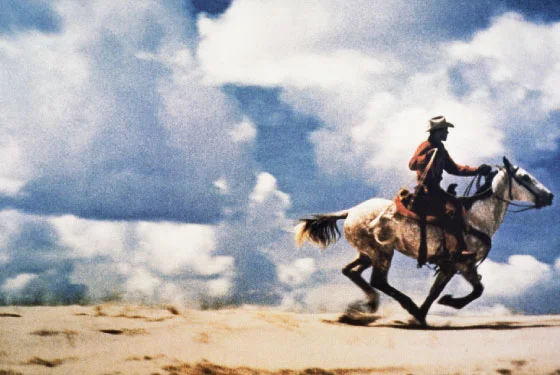
A little further along the continuum we have photographs of photographs.  Richard Prince is well known for his Cowboy photographs.  

Richard Prince came to the attention of the art world in the 1980s for appropriating the Marlboro Man advertisements into his own photographs. When he started appropriating images he was working at Time-Life in the tear-sheet department. “At the end of the day, all I was left with was the advertising images, and it became my subject.” He would rephotograph the advertisementsand then crop them to remove the text and most references to the cigarettes they were selling. Eventually one of his Cowboy photographs would become the first photo sold for more than $1 million. In 2007 he reset the record price for a photograph by selling “Untitled (Cowboy)” for $3,401,000 at an auction.
— James Franco

From this article.


This kind of work where concept is king doesn't appeal to me that much.  But further along the continuum we find ourselves visiting artists such as the recently deceased Lewis Baltz.  From a tribute by Gerry Badger:

Baltz was a leading figure in the field of what has come to be called ‘conceptual’ photography.’ Indeed, he was actually the Professor of Conceptual Photography at the European Graduate School in Saas-Fee, Switzerland. But the term ‘conceptual’ photography, like ‘documentary’ photography, can be difficult to define, and is a complex beast; not quite a school, not quite a defined approach.

But then Lewis belonged to no school, and in his hands, the conceptual approach certainly was both complex and meaningful, unlike so much contemporary photography that pretends to have a concept where in fact it has little, and is merely a regurgitating of formulaic strategies that lack either intelligence or soul.
— Gerry Badger

Baltz is best know for works such as The New Industrial Parks Near Irvine, California.  There's a great deal of over-wrought writing about this work, but Tyler Green does a good job summarizing it here.  From that article:

New Industrial Parks, which Baltz shot in 1974 with a 35mm camera and the help of a National Endowment for the Arts grant, is one of the masterworks of the 1970s. Baltz’s project made our ugly, under-considered treatment of the land into something uncomfortably beautiful, an apt metaphor for the way bad Western land-use policies served as an effective economic engine.
New Industrial Parks gracefully engages with many of the most important art-making threads of its time: conceptualism, the marriage of conceptualism to photography, geometric abstraction, minimalism and artists’ intense engagement with the then-nascent American environmental movement.

Baltz's work appeals to me because concepts are - at the very least - balanced by the aesthetic properties of the photographs.  These photographs can be deeply appreciated without reference to concept or their place in art history.*  They are beautifully crafted images.  They invoke a visceral response.  The aesthetic properties and concepts support each other. 

Duchamp's shovel by comparison, is a bit of a one-trick pony.  It's about the concept.  There is a 'right answer' as to how one is intended to interpret the shovel.  Prince's photographs are similar.  We're meant to marvel at the cleverness of the idea rather than his ability to assemble light and form in interesting ways.   

Many  excellent photographs lie further along the continuum where concept plays a lesser role. Ones where concept is more emergent or implicit.  I appreciate these photographs equally well.  

But I can't help but admire photographs like those from Lewis Baltz that sit comfortably at the balancing point of the continuum.  They are photographs that have a strong conceptual foundation while still being excellent photographs independent from conceptual reference.  

* Perhaps assuming one appreciates photographs of the vernacular.  

From Page Three to Top Three

I've been working on some longer posts but I keep getting stalled in various cognitive cul-de-sacs.  I've also been spinning a bit with the photographs.  The two things are no doubt related.  

With the photographs, I find it best to just make some pictures without worrying about notions like 'why the hell are you taking a picture of that?'.  So, I figure the blogging equivalent is to 'just post something'.

Shrouded, East Side, Vancouver, 2014

"Eric Fredine" is a unique name, so when I do a vanity search on Google for "Eric Fredine" I get results for me.  My various social media accounts rank highly mixed in with mostly photography related things.  

Shortly after publishing the web-site in November, it appeared on page 3 of the search results for "Eric Fredine".  Now it appears in the top three results.  Much credit is probably due to the algorithmic wizards at Google, the thoughtful design created by Squarespace and links from some of my photography friends.  It no doubt helps that I've linked to it generously from my other accounts confirming for Google that the website belongs to the same Eric Fredine.  Still, I found it interesting how quickly it rose.

Oh - and it seems to be the number one result on Bing.  So, hat-tip to the engineers at Microsoft as well!  

Howe and Drake, Downtown, Vancouver, 2015

There have been a lot of steps lately.  I can't tell if I should go with the flow or impose a moratorium.  

Stairs, South False Creek, Vancouver, 2015

2014: Selected Images

it's a tradition for many photographers to select their best photographs from the past year.  For me, best can be fluid and it's frequently in the context of a project.  Caveats aside, these photographs from 2014 stood out for me.  

I've included 20 images.  There's nothing magic about that number.  I selected images that separated themselves from the pack and are reasonably cohesive when presented together.  They seem representative of my photographic interests in the past year.  

I've put some thought into the sequencing, but nothing is intended in the pairings -- they are just how things fell when presented in a grid with two columns.

I was initially ambivalent about the value of a year end review and said as much in a discussion on Mark Hobson's excellent Landscapist blog.  It seemed to me year-end collections often end up being a hodgepodge.  

Still, I thought I'd have a look.  At the very least comparing photographs in a collection is a useful way to separate the truly worthy from the merely good.  After completing the review, I realized I had under-estimated it's value.  

There were some unexpected insights:

  • I think of myself as slinking around in alleys and other in-between places.  But there are as many photographs of the fronts of buildings as their backsides.
  • Entrances figure even more prominently than I would have expected.
  • There are photographs of very ordinary places I've walked by hundreds times.  I didn't think of them as 'photographically interesting'.   
  • The photographs of building facades that don't include the ground work better than I expected.  
  • Many are quite intimate.
  • The ocean scenes don't seem incongruous.
  • Orange - who knew.  

These insights have re-calibrated some of my expectations and will likely impact how I allocate my photographic wanderings in 2015.

Some things did play out as expected:

  • Using multi-level parking garages to gain elevated views of the city is a worthwhile strategy.
  • Photographing in the rain is fruitful despite being a pain.
  • Demolition sites are indeed interesting to photograph.
  • I still like a well placed shadow.
  • Condos as background 'curtains' keep showing up.

I have a particular way of seeing the world.  If anything, it has become even more pronounced in the past year.  I like the resulting visual cohesion.  The range and variety seems richer this year in spite of the focused subject matter.  Seeing a little more confirms for me once again how much more there is to see.

The year end review is humbling in another way.  There are so few photographs to show for it.  It's the nature of the medium.  I'm grateful for the ones I found. 

EDIT: an earlier version of this post had 21 images.  I removed one.  It seemed redundant given the other demolition photographs.  It was also the most recent one in the set.  I need to live with it a little longer.

Abstracts Revisited

Looking through the current City of Glass portfolio I was struck by the absence of alley photographs given the amount of time I've spent wandering them.  The cramped spaces and towering facades present a challenge to my compositional strategies.  In a similar vein, I was pondering how to tackle the cluttered ground level view of condominiums.  These thoughts had the possibly counter-intuitive effect of motivating me to make some abstract photographs.

Backside of the Mark, the Tallest Condo in Yaletown, Vancouver, 2014

Abandoned Frame, Vancouver, 2014

Azure II, Side View, Vancouver, 2014

Creeping Mold, Vancouver, 2014

Column Detail, Vancouver, 2014

This abstract, minimal look is achieved by excluding most context.  I enjoy making such abstracts.  But, I've been avoiding them because I worry they are little more than clever exercises in composition. 

As part of a project they may be more meaningful, because a new context is provided by the project.  So I'm revisiting them in the context of City of Glass

With such minimal photographs there is always the question of how little is too little.    

"Grill Detail" (below) removes so much context it's nearly impossible to tell what you're looking at without being told.  For the purposes of the City of Glass project I prefer photographs with a little more context.

"Column Detail" (above, from an apartment in the West End) may fall into the same category.  But I like how it contrasts with "Backside of the Mark" (at the top, from a condo in Yaletown) to illustrate differences between the West End and Yaletown.

Grill Detail, The Mark, Vancouver, 2014