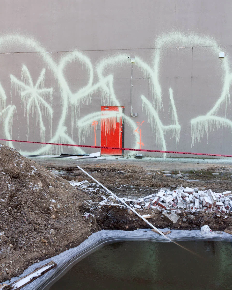
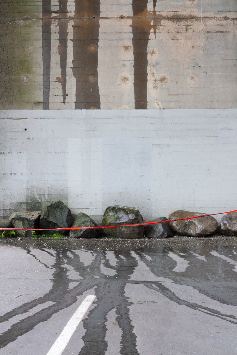
it's a tradition for many photographers to select their best photographs from the past year. For me, best can be fluid and it's frequently in the context of a project. Caveats aside, these photographs from 2014 stood out for me.
I've included 20 images. There's nothing magic about that number. I selected images that separated themselves from the pack and are reasonably cohesive when presented together. They seem representative of my photographic interests in the past year.
I've put some thought into the sequencing, but nothing is intended in the pairings -- they are just how things fell when presented in a grid with two columns.
I was initially ambivalent about the value of a year end review and said as much in a discussion on Mark Hobson's excellent Landscapist blog. It seemed to me year-end collections often end up being a hodgepodge.
Still, I thought I'd have a look. At the very least comparing photographs in a collection is a useful way to separate the truly worthy from the merely good. After completing the review, I realized I had under-estimated it's value.
There were some unexpected insights:
- I think of myself as slinking around in alleys and other in-between places. But there are as many photographs of the fronts of buildings as their backsides.
- Entrances figure even more prominently than I would have expected.
- There are photographs of very ordinary places I've walked by hundreds times. I didn't think of them as 'photographically interesting'.
- The photographs of building facades that don't include the ground work better than I expected.
- Many are quite intimate.
- The ocean scenes don't seem incongruous.
- Orange - who knew.
These insights have re-calibrated some of my expectations and will likely impact how I allocate my photographic wanderings in 2015.
Some things did play out as expected:
- Using multi-level parking garages to gain elevated views of the city is a worthwhile strategy.
- Photographing in the rain is fruitful despite being a pain.
- Demolition sites are indeed interesting to photograph.
- I still like a well placed shadow.
- Condos as background 'curtains' keep showing up.
I have a particular way of seeing the world. If anything, it has become even more pronounced in the past year. I like the resulting visual cohesion. The range and variety seems richer this year in spite of the focused subject matter. Seeing a little more confirms for me once again how much more there is to see.
The year end review is humbling in another way. There are so few photographs to show for it. It's the nature of the medium. I'm grateful for the ones I found.
EDIT: an earlier version of this post had 21 images. I removed one. It seemed redundant given the other demolition photographs. It was also the most recent one in the set. I need to live with it a little longer.


