city of glass

From Page Three to Top Three

I've been working on some longer posts but I keep getting stalled in various cognitive cul-de-sacs.  I've also been spinning a bit with the photographs.  The two things are no doubt related.  

With the photographs, I find it best to just make some pictures without worrying about notions like 'why the hell are you taking a picture of that?'.  So, I figure the blogging equivalent is to 'just post something'.

Shrouded, East Side, Vancouver, 2014

"Eric Fredine" is a unique name, so when I do a vanity search on Google for "Eric Fredine" I get results for me.  My various social media accounts rank highly mixed in with mostly photography related things.  

Shortly after publishing the web-site in November, it appeared on page 3 of the search results for "Eric Fredine".  Now it appears in the top three results.  Much credit is probably due to the algorithmic wizards at Google, the thoughtful design created by Squarespace and links from some of my photography friends.  It no doubt helps that I've linked to it generously from my other accounts confirming for Google that the website belongs to the same Eric Fredine.  Still, I found it interesting how quickly it rose.

Oh - and it seems to be the number one result on Bing.  So, hat-tip to the engineers at Microsoft as well!  

Howe and Drake, Downtown, Vancouver, 2015

There have been a lot of steps lately.  I can't tell if I should go with the flow or impose a moratorium.  

Stairs, South False Creek, Vancouver, 2015

2014: Selected Images

it's a tradition for many photographers to select their best photographs from the past year.  For me, best can be fluid and it's frequently in the context of a project.  Caveats aside, these photographs from 2014 stood out for me.  

I've included 20 images.  There's nothing magic about that number.  I selected images that separated themselves from the pack and are reasonably cohesive when presented together.  They seem representative of my photographic interests in the past year.  

I've put some thought into the sequencing, but nothing is intended in the pairings -- they are just how things fell when presented in a grid with two columns.

I was initially ambivalent about the value of a year end review and said as much in a discussion on Mark Hobson's excellent Landscapist blog.  It seemed to me year-end collections often end up being a hodgepodge.  

Still, I thought I'd have a look.  At the very least comparing photographs in a collection is a useful way to separate the truly worthy from the merely good.  After completing the review, I realized I had under-estimated it's value.  

There were some unexpected insights:

  • I think of myself as slinking around in alleys and other in-between places.  But there are as many photographs of the fronts of buildings as their backsides.
  • Entrances figure even more prominently than I would have expected.
  • There are photographs of very ordinary places I've walked by hundreds times.  I didn't think of them as 'photographically interesting'.   
  • The photographs of building facades that don't include the ground work better than I expected.  
  • Many are quite intimate.
  • The ocean scenes don't seem incongruous.
  • Orange - who knew.  

These insights have re-calibrated some of my expectations and will likely impact how I allocate my photographic wanderings in 2015.

Some things did play out as expected:

  • Using multi-level parking garages to gain elevated views of the city is a worthwhile strategy.
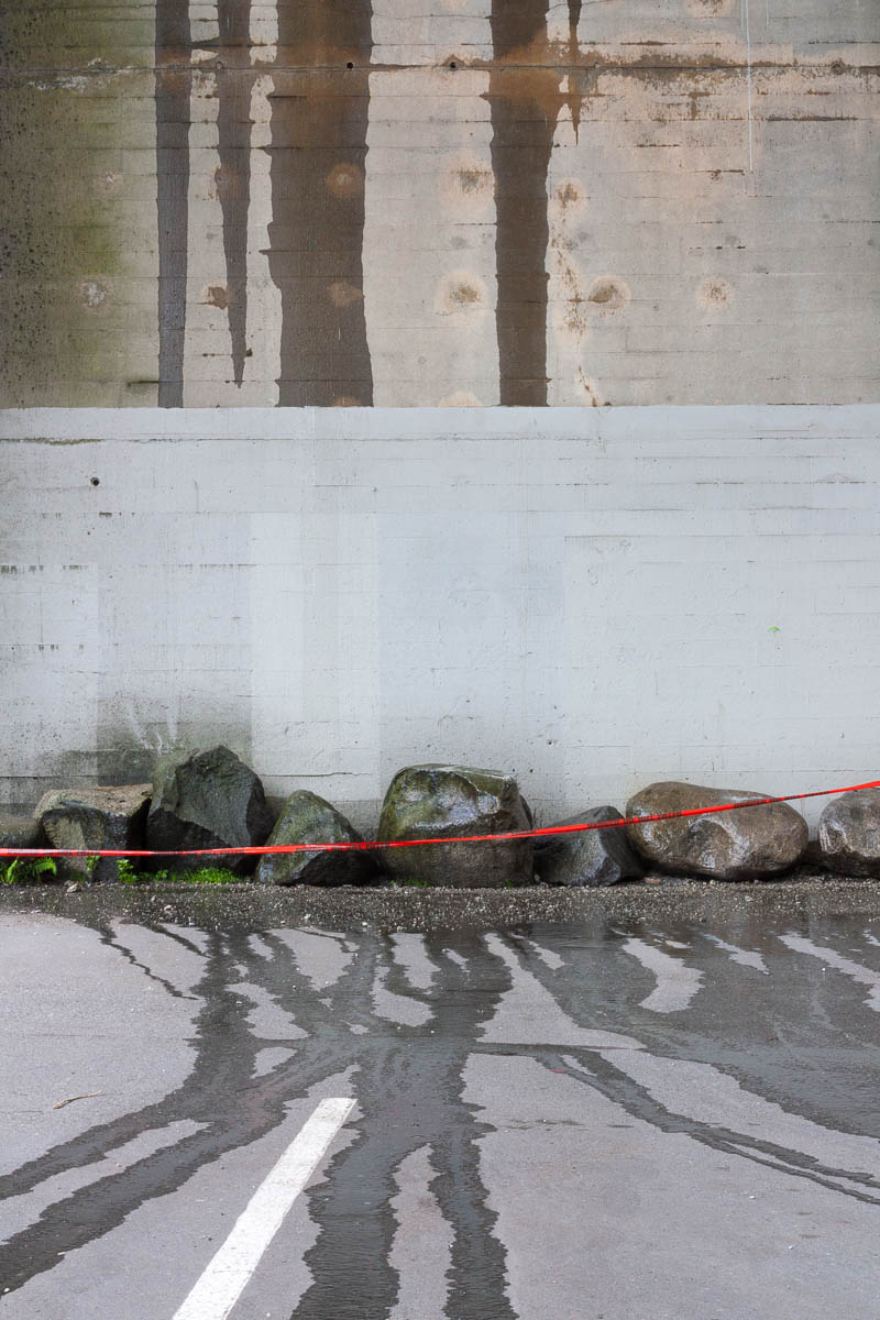
  • Photographing in the rain is fruitful despite being a pain.
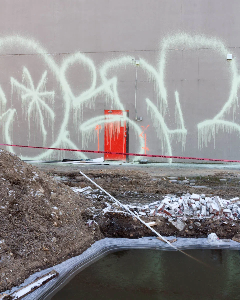
  • Demolition sites are indeed interesting to photograph.
  • I still like a well placed shadow.
  • Condos as background 'curtains' keep showing up.

I have a particular way of seeing the world.  If anything, it has become even more pronounced in the past year.  I like the resulting visual cohesion.  The range and variety seems richer this year in spite of the focused subject matter.  Seeing a little more confirms for me once again how much more there is to see.

The year end review is humbling in another way.  There are so few photographs to show for it.  It's the nature of the medium.  I'm grateful for the ones I found. 

EDIT: an earlier version of this post had 21 images.  I removed one.  It seemed redundant given the other demolition photographs.  It was also the most recent one in the set.  I need to live with it a little longer.

Abstracts Revisited

Looking through the current City of Glass portfolio I was struck by the absence of alley photographs given the amount of time I've spent wandering them.  The cramped spaces and towering facades present a challenge to my compositional strategies.  In a similar vein, I was pondering how to tackle the cluttered ground level view of condominiums.  These thoughts had the possibly counter-intuitive effect of motivating me to make some abstract photographs.

Backside of the Mark, the Tallest Condo in Yaletown, Vancouver, 2014

Abandoned Frame, Vancouver, 2014

Azure II, Side View, Vancouver, 2014

Creeping Mold, Vancouver, 2014

Column Detail, Vancouver, 2014

This abstract, minimal look is achieved by excluding most context.  I enjoy making such abstracts.  But, I've been avoiding them because I worry they are little more than clever exercises in composition. 

As part of a project they may be more meaningful, because a new context is provided by the project.  So I'm revisiting them in the context of City of Glass

With such minimal photographs there is always the question of how little is too little.    

"Grill Detail" (below) removes so much context it's nearly impossible to tell what you're looking at without being told.  For the purposes of the City of Glass project I prefer photographs with a little more context.

"Column Detail" (above, from an apartment in the West End) may fall into the same category.  But I like how it contrasts with "Backside of the Mark" (at the top, from a condo in Yaletown) to illustrate differences between the West End and Yaletown.

Grill Detail, The Mark, Vancouver, 2014

Demolition

Recently, I photographed a couple of demolition sites in Vancouver.  These light industrial and commercial areas are the last of their kind in areas that have already been substantially redeveloped.  Now, they too will make way for condominiums.  Once the new buildings have risen the transformation will be complete.  

Candidates for inclusion in a future revision of the City of Glass portfolio.   

Through the Veil, Vancouver, 2014

Demolition Site, Vancouver, 2014

Making Way, Vancouver, 2014

Exposed, Vancouver, 2014

Frosted Rubble, Vancouver, 2014